
Truth be told, journalists get very excited about newspaper redesigns. They will have been months, sometimes years, in the planning. But readers tend to take them in their stride.
No doubt you will have noticed the changes in today’s paper: the handsome new masthead on the front page, the stylish new headline typeface, the crisp typeface for the text.
But that is not what you have bought the paper for, and the design team knows it. The best newspaper designs are always in the service of the stories. And the stories are what The Irish News has been about since it was founded. Appropriately enough that date is reflected in the new masthead – Trusted since 1891. And trusted it is.
Few papers have such a close relationship with their readers, and The Irish News’s position as the best-performing regional daily in Ireland and Britain confirms that.


So the paper is wearing a new suit, and the digital platforms are also being reconfigured. But the quality of the journalism is the same as it was yesterday and will be tomorrow.
There is a common misconception that news design is about creating pretty pictures on a page or screen. But news designers are journalists who use the tools of typography and imagery to give you, the reader, additional information about what you are seeing.
The importance of the story is reflected in its placement on the page, and where it sits in the paper; by the size of the headline, and the use of other typographical elements – the small headlines above a main headline (straps) or below (subheads – the jargon is self-explanatory). Images draw the eye and encourage the reader to linger rather than turn over the page – and yes, even the most print-obsessed journalist will accept that a picture is worth a thousand words; ‘white space’ allows stories to breathe.
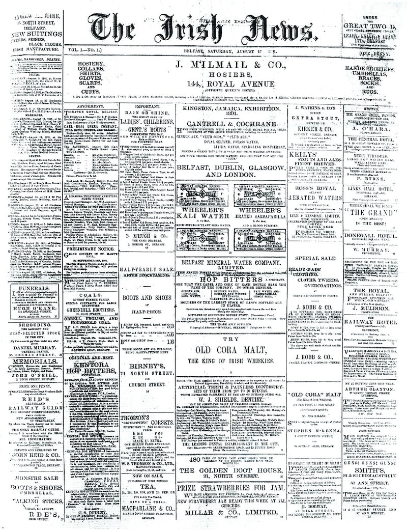
Older readers will remember The Irish News as a traditional ‘broadsheet’ newspaper, with its distinctive old-style masthead in a typeface commonly called ‘Old English’ which mimicked calligraphy. In the early days, the front pages were given over to advertising – it costs money to gather news, and it still does. Ever the pioneer, The Irish News was the first paper in Ireland to put news on the front page. The outbreak of the Second World War warranted it.
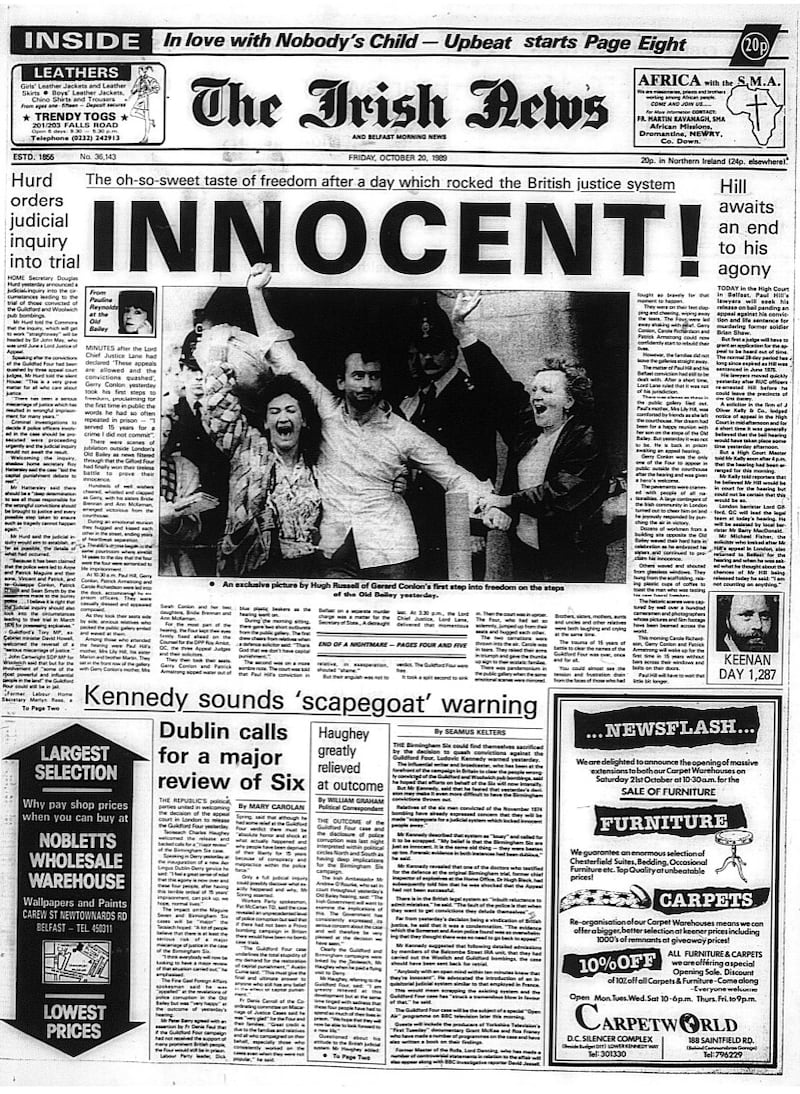
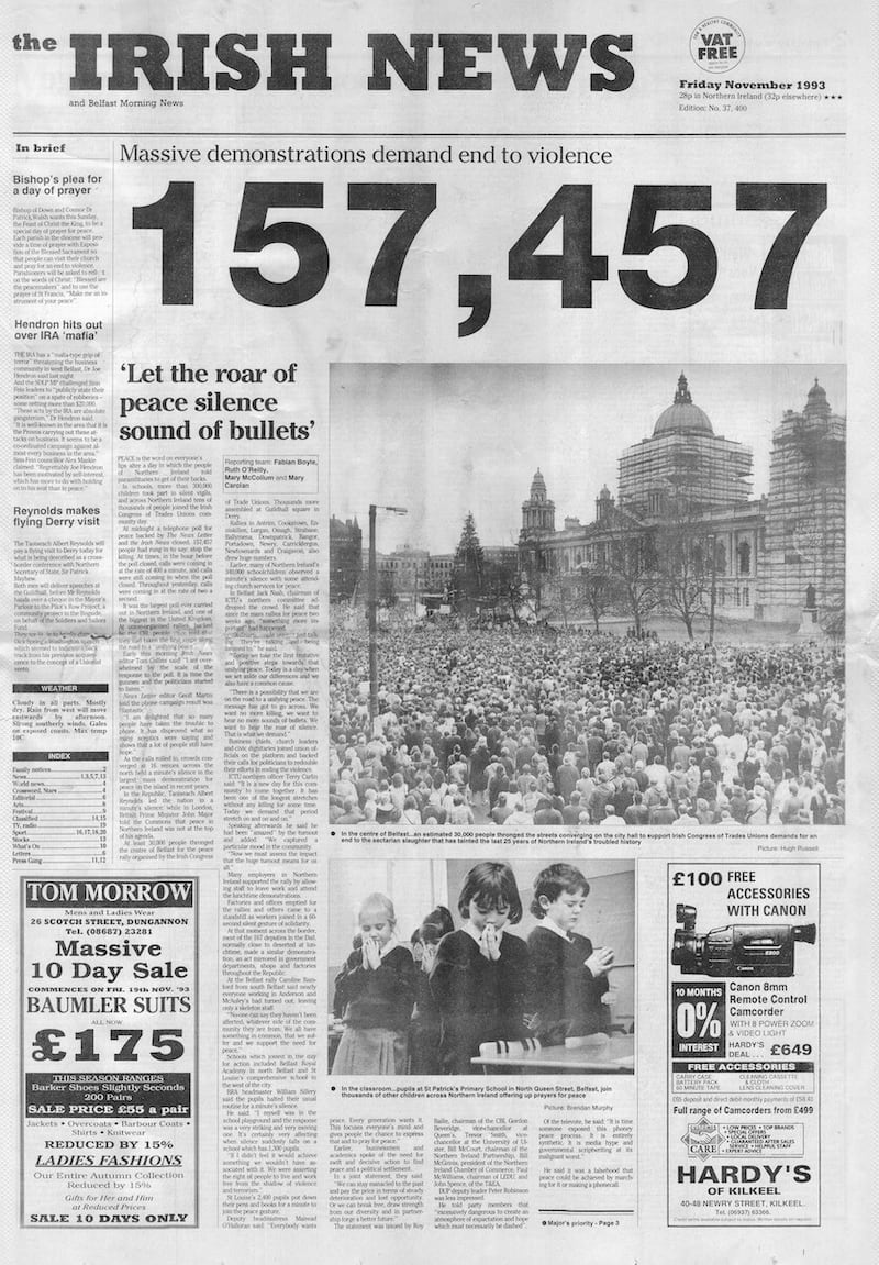
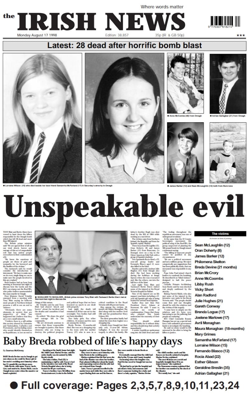
The Irish News has always been renowned for its photojournalism, and it was never afraid to run an image across a broadsheet front page. Many of the most compelling front pages during the Troubles and beyond were image driven. But up to the mid-1930s the paper was primarily type-based, with pen and ink sketches used to illustrate stories and features. Photographs are reproduced by transforming images into tiny dots (think pixels), and these were done by an outside firm until the 1950s, making the process slow and expensive.
Design was also influenced by external factors such as the cost and availability of newsprint. It may look like cheap paper but, given the quantities involved in a large print-run, costs mount. Rationing after the Second World War impacted on the paper’s size (pagination), and in a newsprint crisis in the 1990s the width of the broadsheet page was reduced to save costs – though the change was largely invisible to readers. The 1990s, and this first two and a half decades of the 21st century, have seen the most dramatic changes in the design of The Irish News. The catalyst was the late Jim Fitzpatrick – a visionary if ever there was one – who was determined to transform the paper, and did so as chairman.
In the 1991 redesign, which I was responsible for (I was then deputy editor), the only thing that did not change was the paper it was printed on. The influences were three key figures in contemporary news design – Frank Ariss, David Hillman and Mario Garcia. The brutalist new masthead, in Rockwell Extra Bold, was controversial. But it was designed to ensure the paper made its presence felt on the newsstands – print then was still king, and The Irish News was competing for attention with some 18 other titles.
The other elements were a rigorous modular design which made stories easier to read, and pages easier to design under the pressures of a deadline, and a new typeface – Cheltenham, which printed well on the paper’s then ageing presses. The most controversial move in this period was shifting the death notices from page 2 (and often into page three) further back in the paper. There was panic internally for a day, but the readers weren’t that fussed as long as they were there.
By the end of the nineties, the broadsheet had had its day. It was more difficult to handle than smaller papers and market research suggested readers – and potential readers – would embrace a new format. The term tabloid was still tainted by the excesses of the Fleet Street red tops, and Jim proposed the Berliner. Popular with European quality papers, the Berliner was the same width as a tabloid, but longer. The Irish News, once again, was the first daily paper in these islands to embrace it.
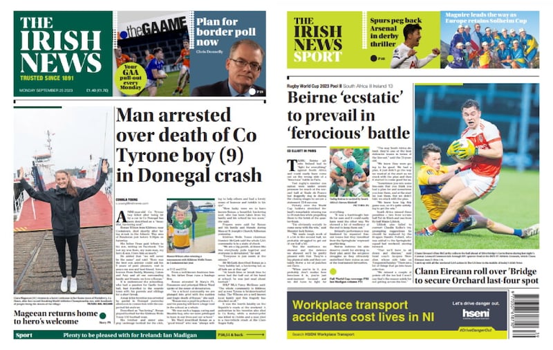
Having done its duty, the Rockwell masthead made way for something a little more refined, and the masthead is now undergoing another transformation.
Like the best designs, this one started not with pretty pictures on a page, but is rooted in the paper’s mission to “inspire debate by telling compelling stories”. The logo’s Wicklow typeface, inspired by the stone artist Michael Biggs, in its rich deep green livery (Pantone 3292 CP for the geeks), speaks to the paper’s Irish heritage. Next to it, the 32 balls bordering the striking front page ‘blurbs’ (promoting inside content) signify an all-island identity.
Colour is an important navigation tool, and you will see sections – news, world news, sport, business and so on – have their own distinctive identity.
Serifs – the little triangles at the end of the letters – denote quality and make type easier to read. Another serif face (an updated version of our old friend Cheltenham) is used for the text you are reading now. The paper’s secondary font is Helvetica Neue Condensed – a classic but modern face without serifs.
The use of the definite article – The Irish News – underlines the importance of the paper as an institution within Irish journalism, and its role as a thought leader.
The headlines are in a serif typeface called Utopia – more than a nod to Jim and Alice Fitzpatrick who were devoted to the Tudor statesman-philosopher Sir Thomas More, author of Utopia, executed by Henry VIII, and canonised in 1935.
The modular design will make the paper easy to navigate and read. Photojournalism will continue to distinguish and enhance its pages.
All in all, this redesign gives The Irish News a fresh bold look, but one built on its heritage. But, at the end of the day, it’s not about the looks. The Irish News has never been about style over substance.
The journalism remains at the core of what the paper is about. Today you might be more aware of how it has been presented. By tomorrow the design will have faded into the background, and the stories will have primacy – which is how it should be.