A flag of the world which averages out features found in current designs from around the globe has been created.
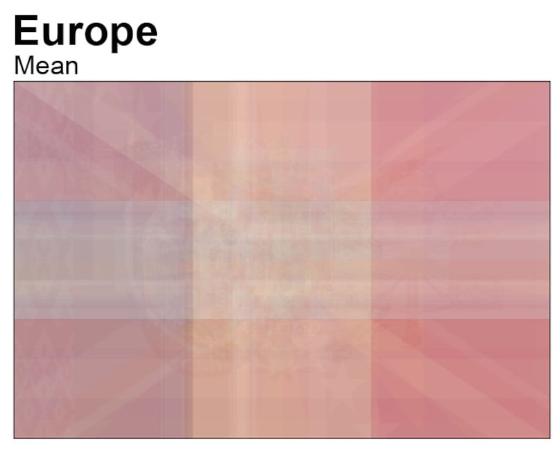
The end result shows muted colours with a three-by-three grid clearly visible – created by the plethora of flags which have three vertical or horizontal stripes.
It has been created by a software engineer who made the average design – also known as the “mean” – by digitally stacking existing flags.

A faint diagonal cross is also visible, while the Union Flag is identifiable in the top left corner – where it features on the flags of numerous Commonwealth countries.


The engineer, who uses the Reddit handle Udzu, digitally analysed the designs of the 195 flags of countries recognised by the UN as members plus observers for the project.
But he didn’t just make one flag with his data.
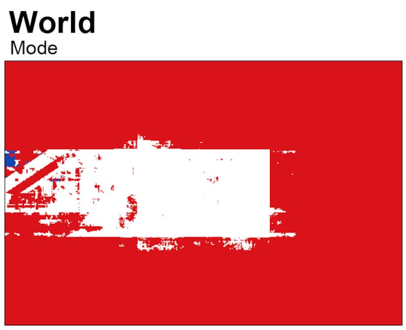
Udzu create three different versions of the world flag – a mean, median and mode which are all different sorts of averages – and which resulted in massively different outcomes.
The modal version, which looks at the most common colour at any given point on a flag, resulted in a design which was very red, with a blurry white rectangle extending from its centre and a smudge of blue.
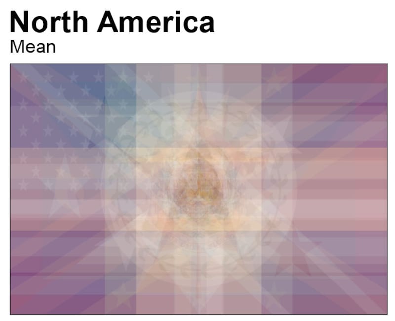
Udzu used the same method to create those three average flags for different continents and geographic areas.
The whole project only took a few hours, Udzu told Press Association.
To start, he pulled in the flags of the world, as used on Wikimedia and made sure all the flags were in the same proportions.
Then he standardised the colours in the case of the mean and modal flags and converted to greyscale for the median flags.
“The mean corresponds to blending all the flags together, a bit like a projector,” Udzu explained.
“The mode corresponds to showing the most common colours at each location.
“The median is a bit less intuitive. It roughly corresponds to the most typical brightness at each location.”
After sharing his creation on the sub-Reddit Data Is Beautiful it was upvoted more than 27,000 times.
In a second version, Udzu used the same methods but weighted the flags for a country’s population and area.
Average flags of the world #2: mean and mode flags weighted by population and area [OC] from dataisbeautiful
It means that the flags of Brazil, the US and Australia dominate the designs in their respective regions.
The source code for the project has been shared on Github.


