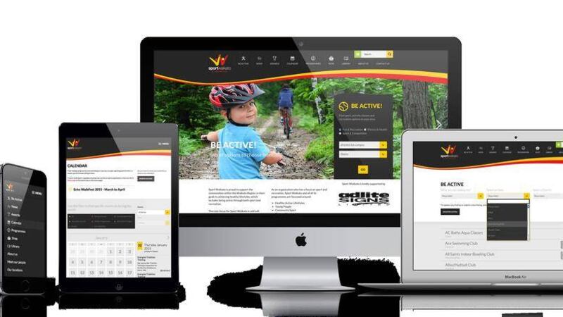
Google is adding mobile performance to its search engine optimisation (SEO) equation, and that has companies reevaluating web strategy to avoid losses in search rankings.
Recent changes to Google's search algorithms - in other words, how Google carries out its search for you - may upend traditional understandings of what constitutes 'good content' on the web.
As of April, Google's algorithms will incorporate "mobile-friendliness" as an additional factor in ranking the worthiness of content search results. When it comes to SEO, websites that look good on mobile devices will get higher placement on Google's organic search (getting your business web-site to appear on page one of a search and not page two or three!).
With the number of mobile devices surpassing desktops and accelerating rapidly, mobile awareness is becoming an increasingly important factor in content development. Businesses and the digital agencies that support them are on notice. Since announcing its intentions in February, Google has reported a 5 per cent increase in mobile-friendly sites across the visible web.
What are the implications of mobile awareness? For starters, mobile web design matters. Many digital marketers and webmasters now optimise digital content for organic search rankings (not paid for). With the explosive growth of mobile devices, those maintaining sites need to test the quality of mobile displays and make the necessary updates. Google will track and rate content based on viewing experiences for smartphones and tablets.
What should business do? At a minimum, a site should feature modern web page designs, including beefy images and easily clickable graphic elements. The text needs to be large enough for easy viewing on small screens. Links should not be too close together to cater for big fingers on small screens! The content should fit the screen size as the days of scrunching lots of text together with hard-to-navigate links are thankfully over.
If nothing else, a graphical refresh for established websites is likely in order. Replace 'Flash' (old video type) elements with mobile-aware videos. Simplify and enhance visual elements. If you haven't already, perhaps it's time to adopt responsive web design, which ensures that page views and navigation links resize dynamically across multiple browsing experiences ??? desktop, tablet and Smartphone screens. Most of today???s web content management (WCM) software systems include the ability to automatically adapt to the different screen sizes.
There is also a larger context to consider. Mobile experiences are not just about screen sizes and device types. Mobile SEO is not the same as organic search from desktops. There are reasons why different experiences favor different results.
Content or web-site "findability" has been a cornerstone of browsing experiences. Web searchers enter a text query into Google's search bar and review the results. In that environment, we rely on words and other signals, indexed by Google, to retrieve content from websites. This is often termed a "pull" experience.
Findability remains an aspect of mobile experiences. But often mobile users are engaged in much richer and more dynamic work environments. They are out and about, doing things and focusing on specific tasks and activities. They expect short snippets with quick responses. Reading a long document on a small screen is rarely a satisfactory result.
Moreover, a Google search recognises mobile-friendliness based on device types and provides links to the sites that are most easily viewed. While this is a step in the right direction, mobile users will expect a lot more.
There is a fundamental transformation currently under way. Desktop search is typically a pull experience, while mobile is more of a push. Mobile users engaged in tasks expect finely tuned, personalised and task-oriented experiences. But mobilizing search is only a first step. Google offers other techniques for returning relevant content, such as semantic search, based on its underlying knowledge graph. And many publishers offer mobile apps that access specialised databases for popular topics and activities.
The challenge is to develop useful and profitable mobile experiences. Whenever things change, it's essential to question the status quo and allow innovation to step into the business environment. To this end, Google's new emphasis on mobile friendliness is such a watershed moment for today's websites.
Digital marketers and webmasters must respond in kind or risk losing their ranking and relevance among users. Once they have a mobile-friendly site, savvy business leaders should build and deliver task-oriented experiences that meet the needs of target audiences. It is time to truly capitalise on mobility and optimise for the mobile revolution.
:: Trevor Bingham (editorial@ itfuel.com) is business relationship manager at Fuel in Craigavon. Follow them on Twitter @itfuel.


